THE SALT LINE
NO GRIT, NO PEARL
THE PROJECT
The Salt Line merges the historic fishing cultures of New England and the Mid-Atlantic.
THE BRIEF
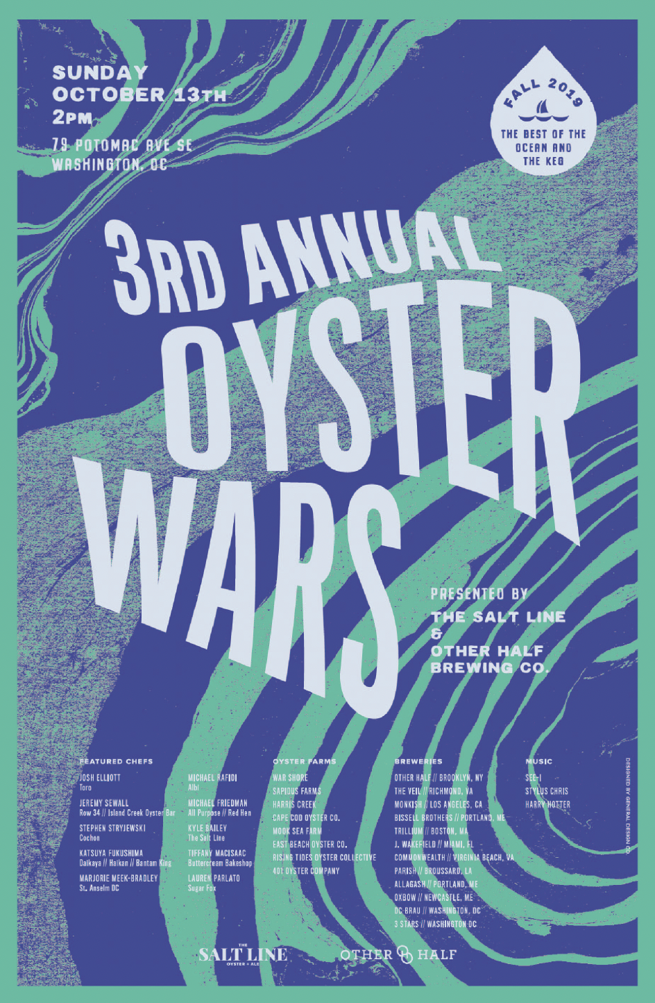
From its inception, the aim was to merge the coastal vibes of New England and the Mid-Atlantic. The visual identity we created ranges from classic and nautical, to cheeky and family-friendly. The typeface is bold and clean. The menus are a deep dark blue and gold, while accents of red are a nod to their MLB neighbors across the street, the Washington Nationals. The details in the pointillism oyster shells draw inspiration from sand on a beach, while oyster and sea monster illustrations tie the identity together with instagram-friendly details.
SPECS
CLIENT
SERVICES
Strategy
Naming
Verbal Identity
Visual Identity
Art Direction
Menu System
Ephemera
Swag
Packaging System
Signage
Web Design
Motion
Production Management
COLLABORATORS
Clients: Chef Kyle Baily, Jon Ball, Jeremy Carman, Gavin Coleman, Paul Holder
Architecture + Interiors: Grizform Design
Photographer: Greg Powers
THE WORK
Photo by Greg Powers
This was embroidered by one of the client’s mothers—thank you Mrs. Holder!


